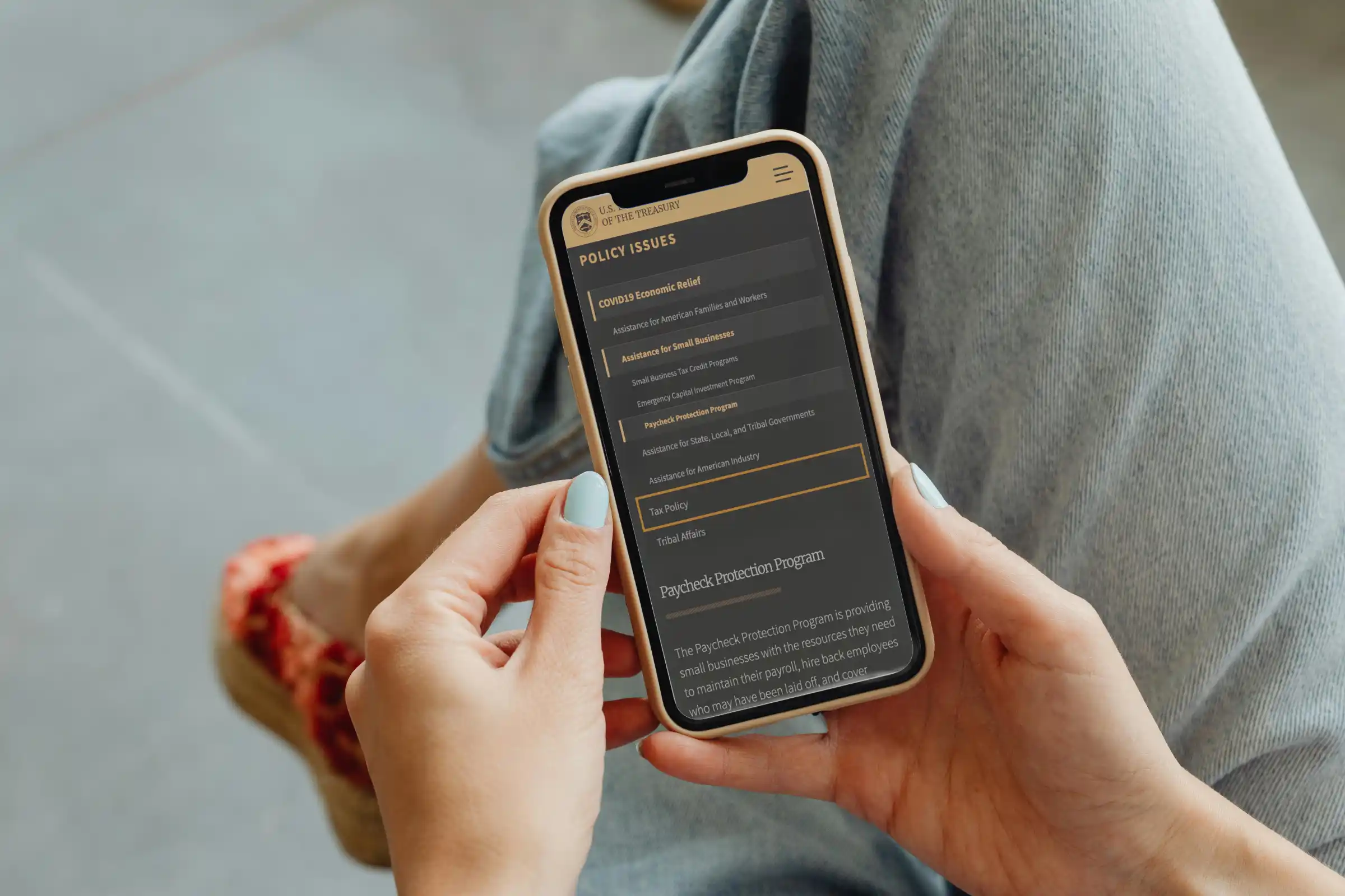
I joined the Treasury as a product designer during the COVID-19 crisis. Right as the administration was rolling out stimulus programs. My office needed to stand up trustworthy, working software to support these programs asap.
I worked with developers and content strategists who launched several sites in record time. But there was a problem: each team was reinventing the wheel for design. Different colors, fonts, sizes, and button styles made our sites look inconsistent and unprofessional.
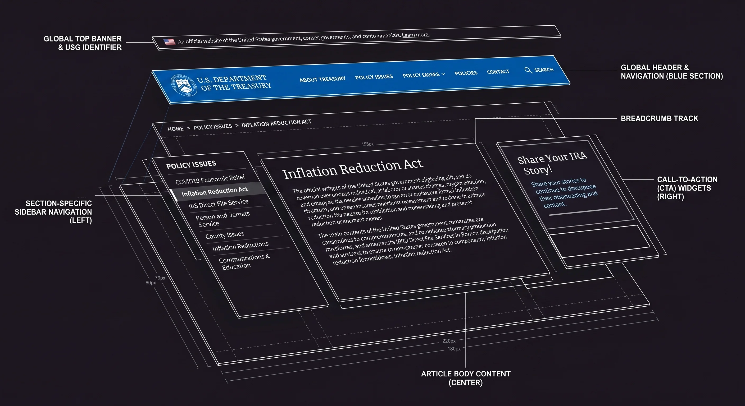
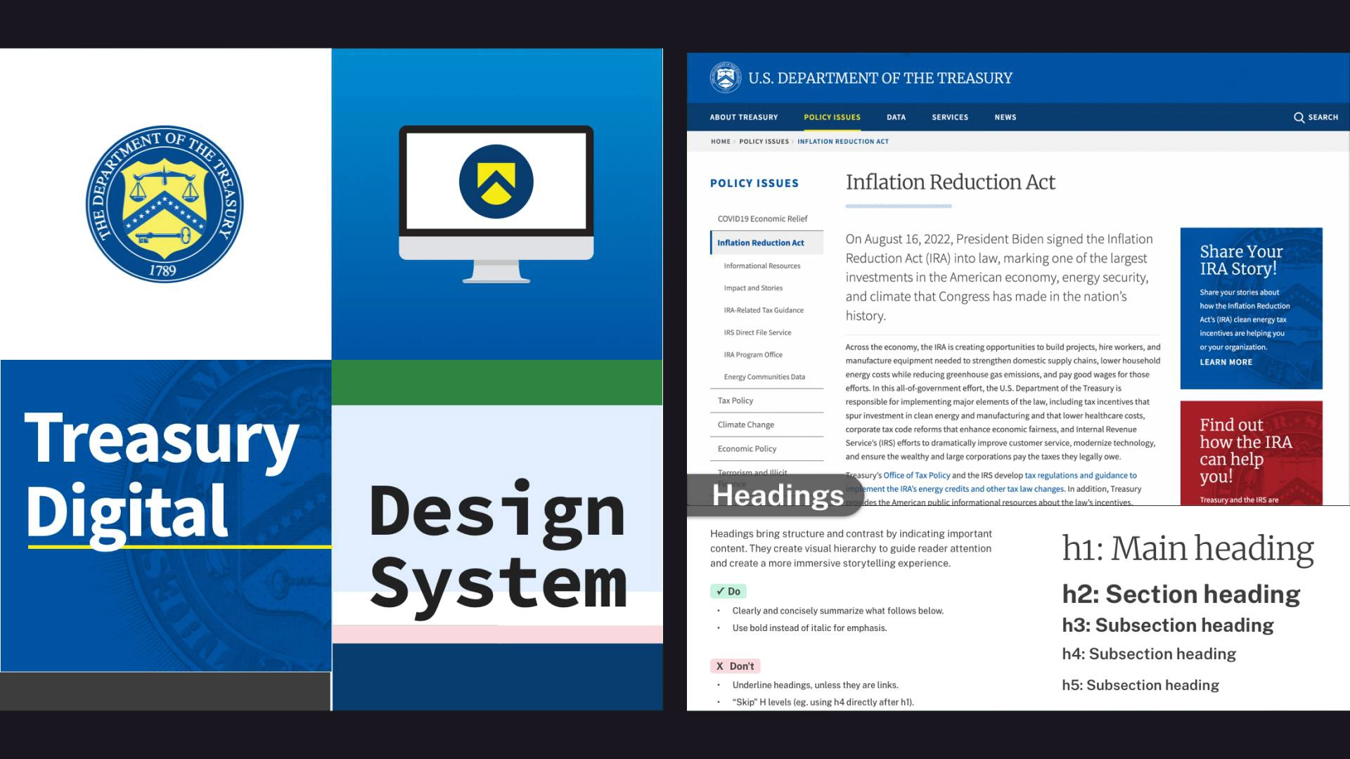
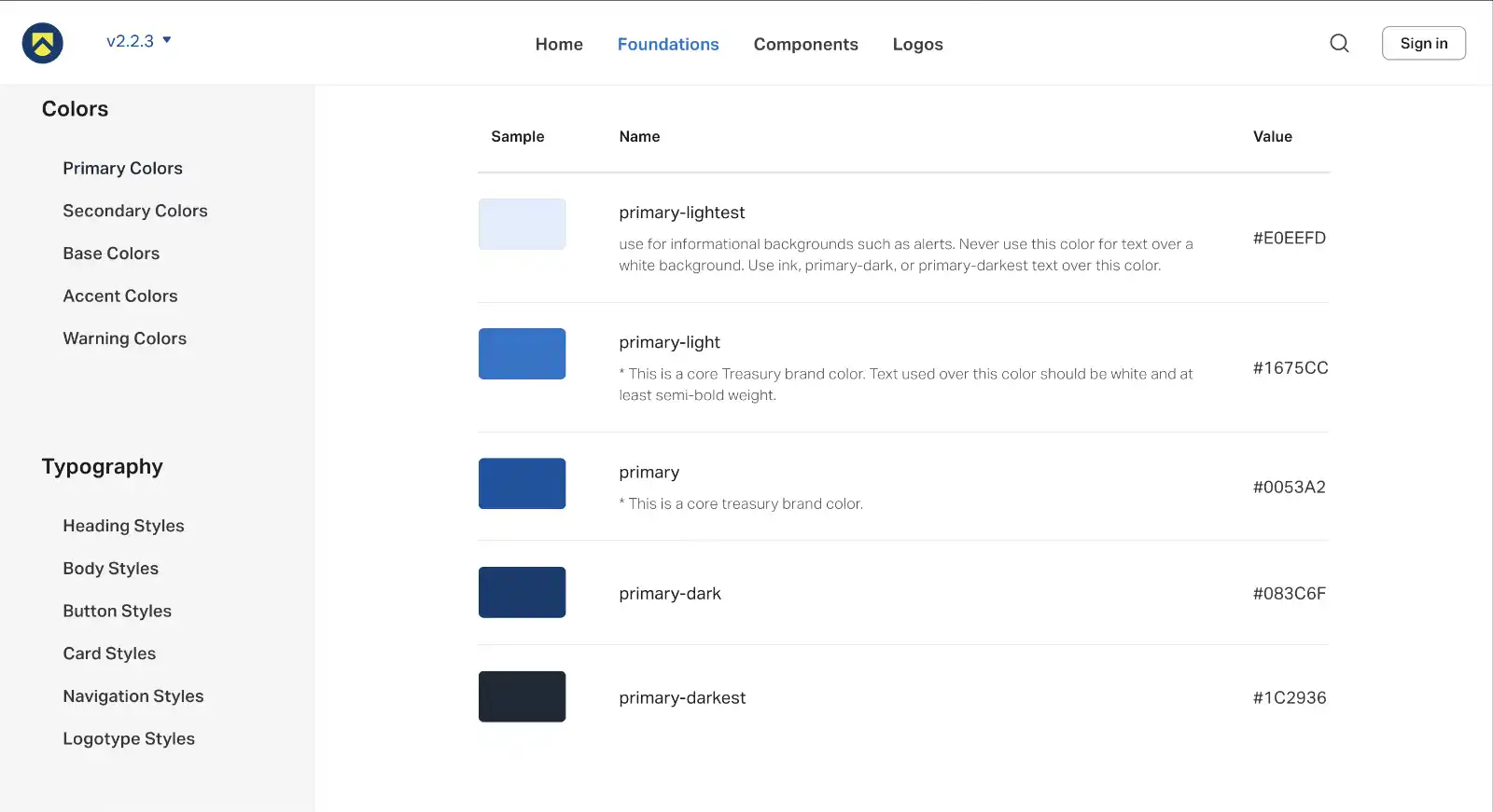
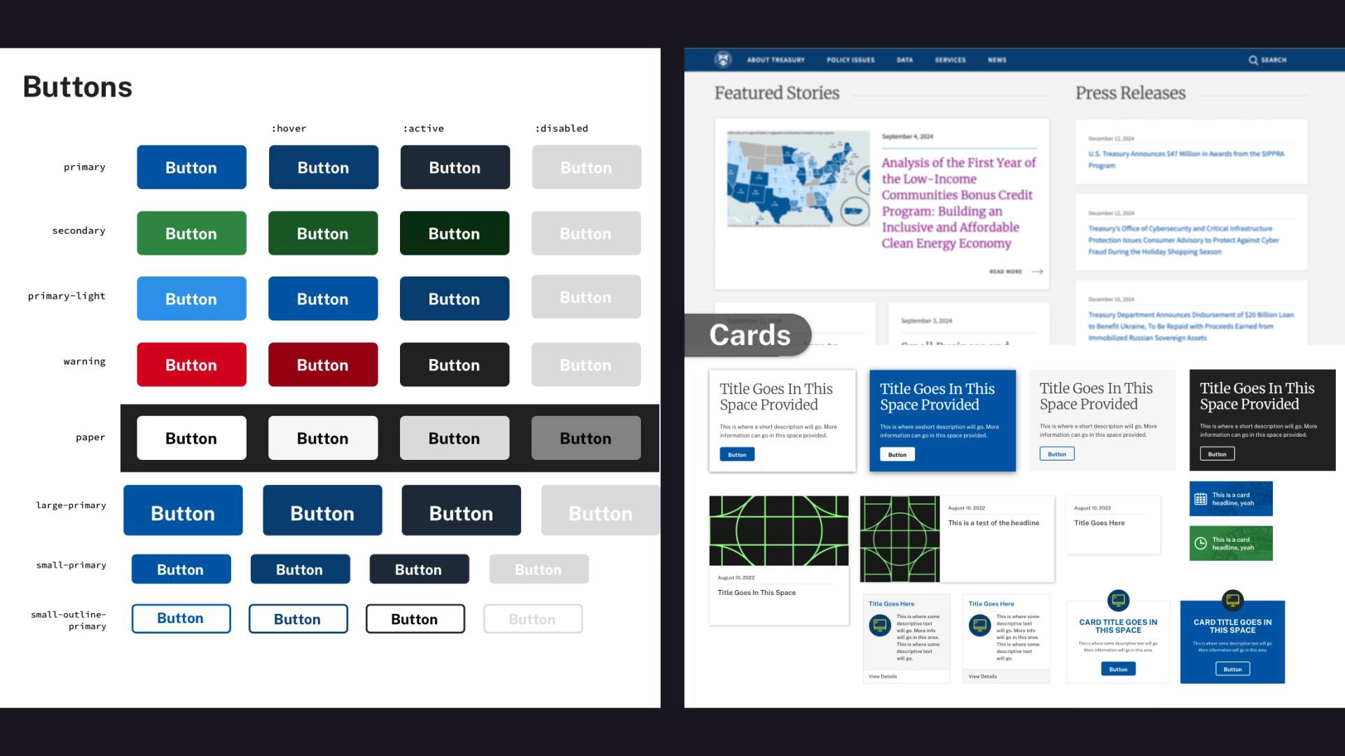
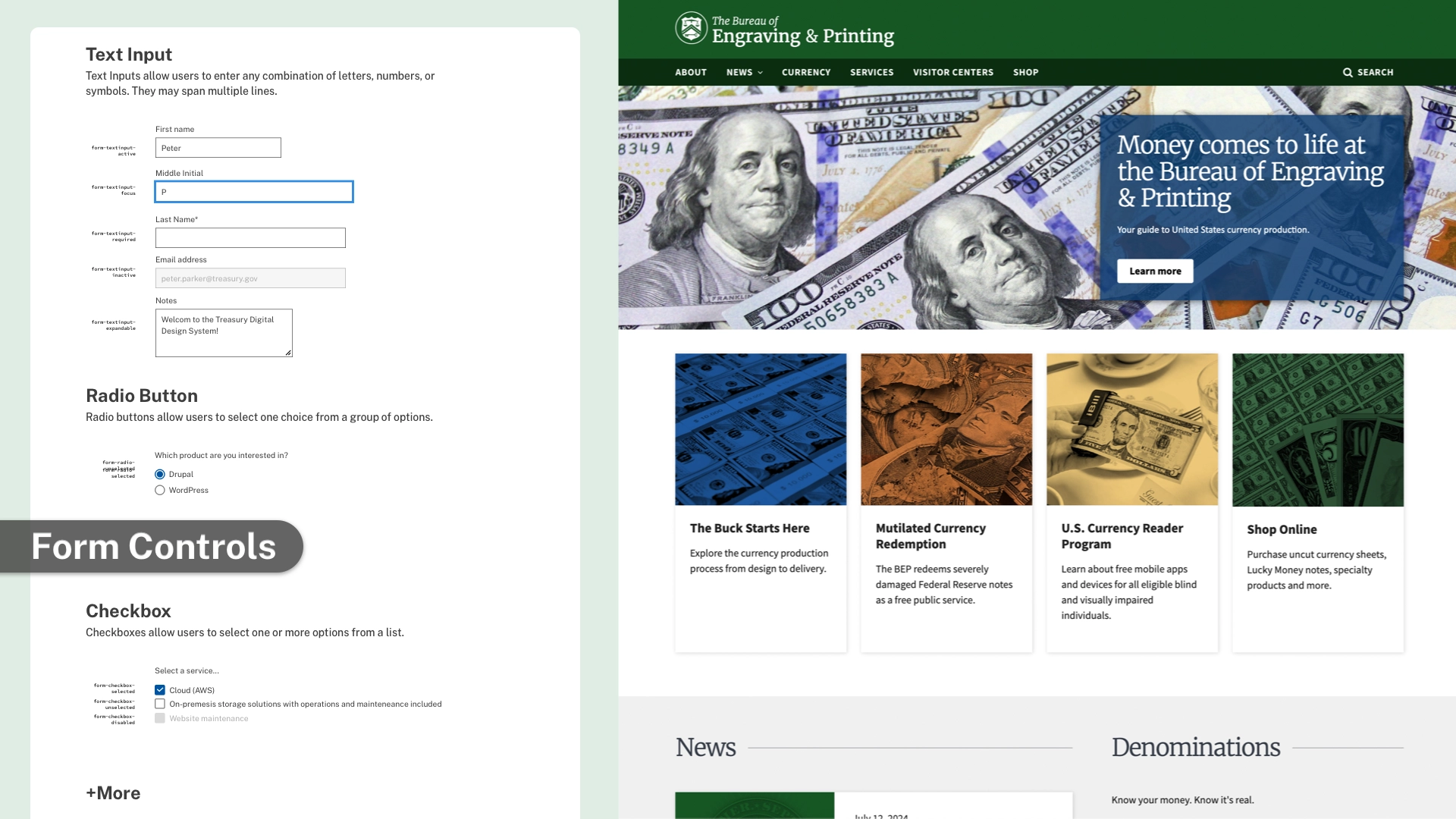
After some research, we remixed the U.S. Web Design System to help our teams ship higher quality software faster. Our version has official branding, a library of accessible components, and a detailed user guide. I built components in Figma, wrote documentation, and conducted accessibility audits on our existing apps. Over a dozen projects use the design system, but you can see it in action on treasury.gov or bep.gov.
Reusable Components
Congress shall make no law respecting an establishment of religion, or prohibiting the free exercise thereof; or abridging the freedom of speech, or of the press; or the right of the people peaceably to assemble, and to petition the Government for a redress of grievances.
Accordion Guidelines
When to use: Use to organize and hide content to avoid overwhelming users, especially when they only need specific pieces of information.
When not to use: Avoid for critical information that everyone must see or for low content volume where condensing adds unnecessary cognitive load.
Primary Button
Primary Button Guidelines
When to use: Use for the primary action on a page or form. It should be the most prominent action visually.
When not to use: Avoid having multiple primary buttons on the same page as it creates visual competition and confusion.
Date Picker Guidelines
When to use: Use to help users pick a date, especially when they need to see the day of the week or when the date is relative to today.
When not to use: Avoid for well-known dates like birth dates, where typing or selecting from lists is often faster.
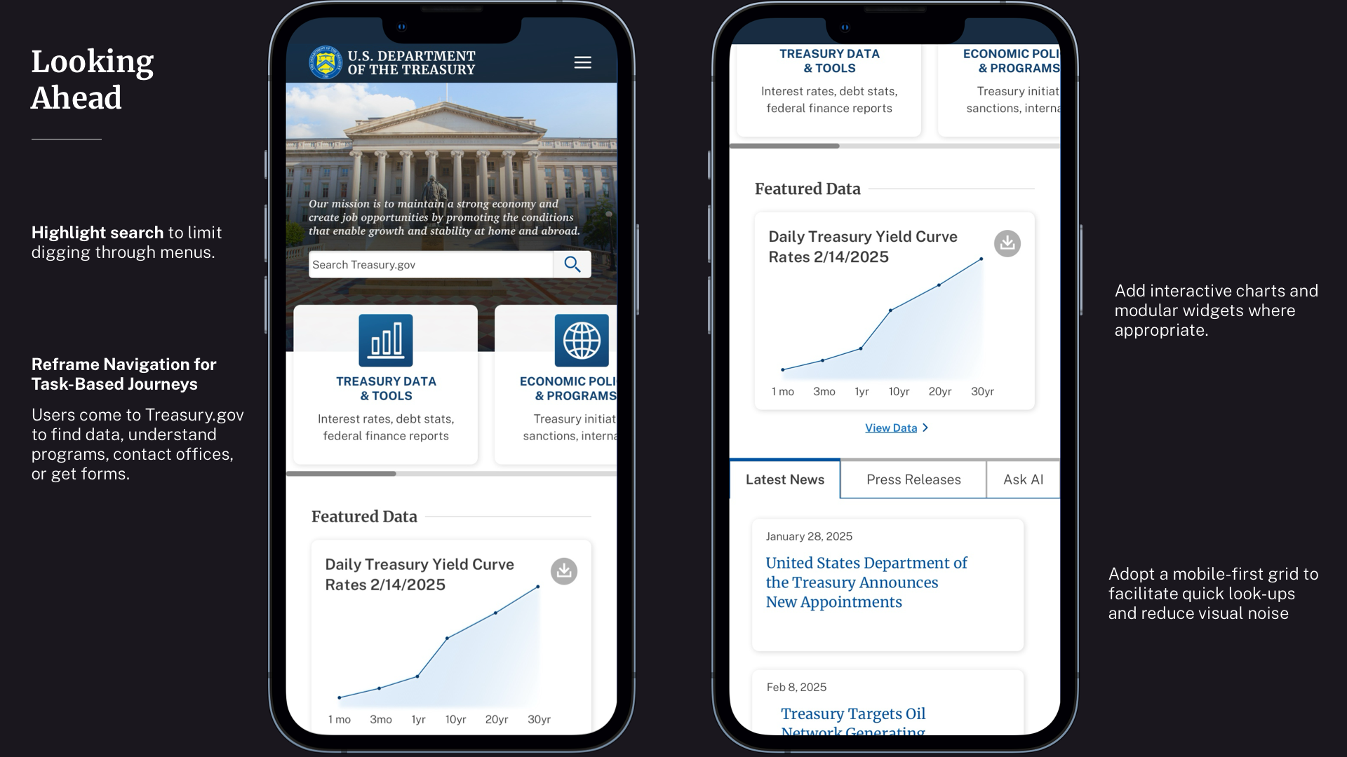
BEFORE: Text-heavy static pages, complex navigation, and inconsistent styling. Data is hard to find. Slow updates.
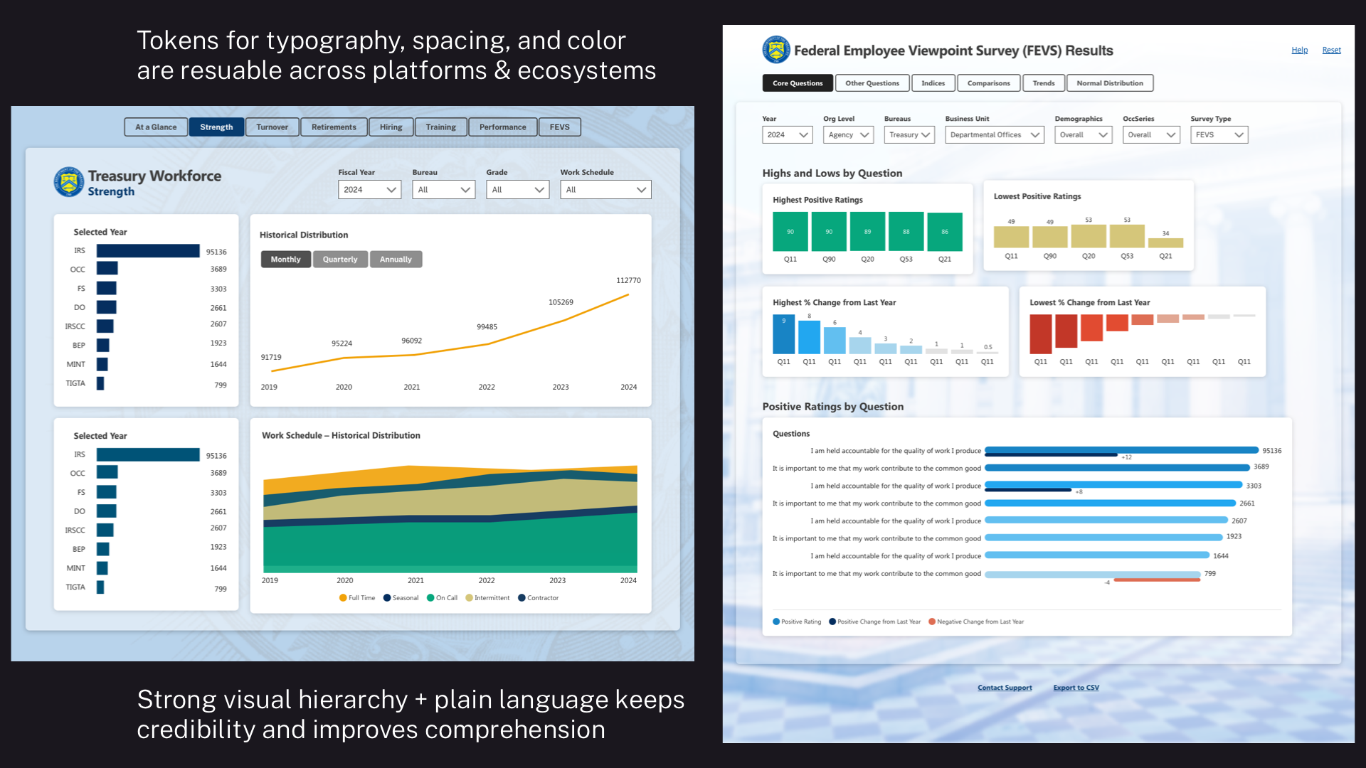
AFTER: Designers use AI agents with design system skills to ship clean layouts with structured data visualizations in hours.